
T-shirt Design with Atari
T-shirt designs are produced with
screen-printing. How to make a screen-print graphic is shown in my little
workshop here. Basic understanding of a vector graphic program will be useful.
For screen-print you better not use thin lines
or dots, because they will get lost in the small resolution,
I had the idea to vectorize the picture I want to use. This has the
advantage that we increase the vector graphic size without getting "pixel
steps". By the way, vectorized motifs look extremely
cool.
Preparation for vectorization
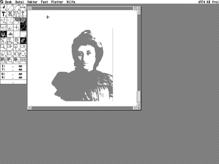
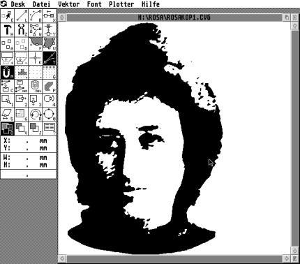
I chose as a
motif a picture of Rosa Luxemburg. I scanned the
picture from a book cover and and loaded it in TIF format into the
graphic program Chagall to prepare for the
vectorization.
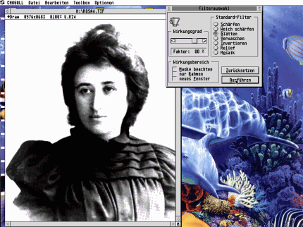
First I softened the
picture to get rid of the raster (the picture was converted to little dots for
the printing process). The next step is to get rid of all gray areas by
increasing the contrast very high. Do so by moving the button Kontrast to the
right and incease the button "Helligkeit" (Lights) a bit as well,
or change
the gradation curves.
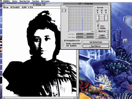
The result
looks almost like a real black and white graphic. Nice. Now we can change it
to a real bitmap which consists only of black or white pixels. I use
the "Apple to Pear" menu of Chagall and increase the picture by factor
2. This way I receive more information for the
vectorization.
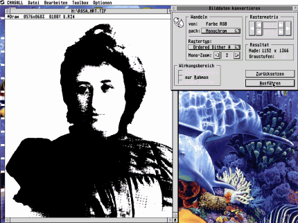
I save the black and
white picure as Image *.IMG just by typing the extension IMG. Chagall will save
it in IMG format.
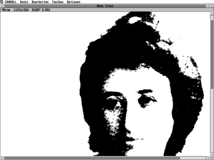
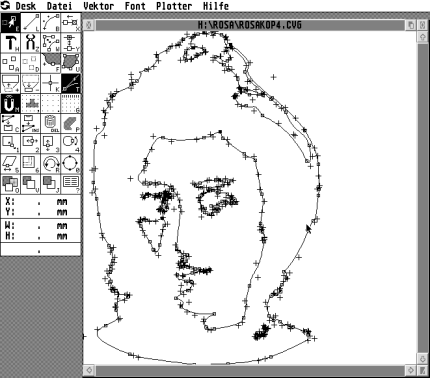
The
vectorization
After finishing with Chagall I start Avant Vektor Pro, a
vectorization and vector editing software. I load the freshly-produced *.IMG
picture and choose "Bold and round" (Grob und
Rund) as a vectorization parameter.
Just test vectorization with
different parameters for best results. It should not become too bold, but
there shouldn't be to many
redundant dots/points.
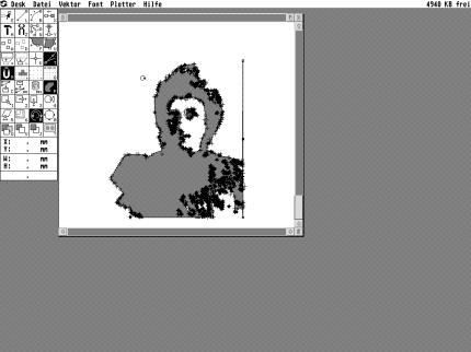
After the
automatic vectorization comes the
manual work.
The vector graphic looks
"rough".
Lines have to be opimized, to
make it look cool. That's hard manual labour and real detailed work.
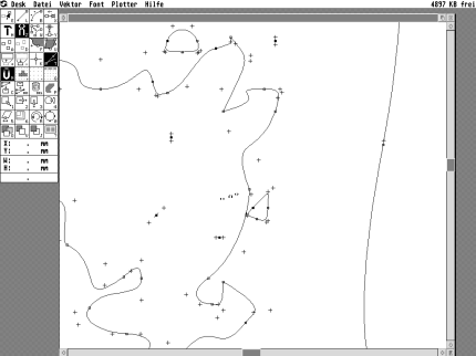
Unnessesary points are deleted and the splines have to
be corrected afterwards. The little crosses have to be moved to do
that.

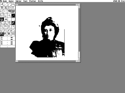
I created the highlights in the
hair completely to make the graphic look "quieter" and more
"sovereign".

The
smoothened vector graphic looks now like
pop art.
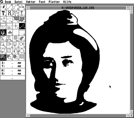
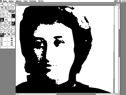
Because the graphic has to be printed in
white on a black
shirt we have the problem that all black areas of the image will become invisible.
To
get an impression of how the graphic will look on a T-shirt I put a black
T-shirt shaped object in the background.
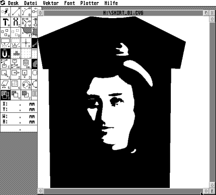
We see only the face and the
highlights in the hair. I have to make the hair visible by doubling
the hair curves, which describes the
outline of the hair.
Curved text
path
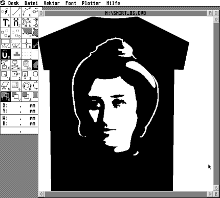
Now I have the head I complete it
with a quotation
from Rosa Luxemburg. To achieve a fitting picture is a real art. I have choosen
to let the text run above and below in a semi-ellipse around the face. I do
so by taking sections from a slightly flattened circle.
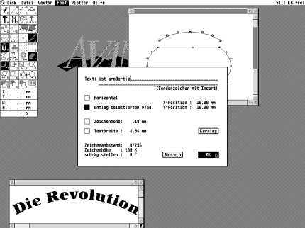
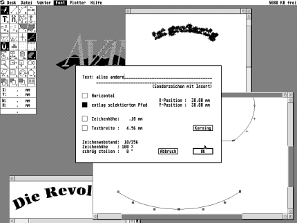
I
chose the font "Antiqua" because the resulting style
suits the 20th century, the time when Rosa Luxemburg became
famous. By setting the text on the circle above you have only to metion that
the circle piece has to be selected. I do the type work in a second
window from which I copy the finished type to the main graphic. Setting the
under text into the circle bow I have to change the direction first by
choosing [R] (direction function) and clicking on the end of the path.
The empty path end becomes a black point. In the text
menu I now have
to increase the space between the letters to avoid them sticking
together. To fit the type into the graphic, I make the hair highlight
thinner and move the higher hair curve around the "i" dot. At the
left side I open the hairline to make space for the writing. Many hours and
steps not shown here later I am satisfied with
the design.
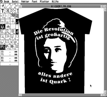
Et
voil�.
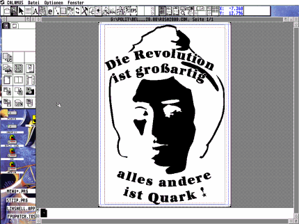
Preperation for the film
setting
Now I have to
prepare the graphic for printing. Because the graphic will be printed in
white print, everything which will be seen on the black background in
white has to be inverted to black. The output is prepared in Calamus SL. I
get the size of a T-shirt first to make the graphic the right size. I select
the button "propotional resize" before I size the graphic to the
right
width. Having done so I decrease the height of the document to the space
actually used.
The
export
Usually one saves the document and the used fonts on a
disk. In my case all fonts were converted to vector paths in
Avant Vektor Pro, only the CDK document itself was needed. Smaller documents
can be saved on a floppy disk. When working on bigger projects you better
call the Calamus service center first. Those can be found here:
Ask the service center first
which media they can read and how they have to be formatted. It is important to
tell the imagesetter operator that it is a screen-printing exposure, because the
motif has to be on the film "right" and not mirrored like for
offset printing.
The print
There are two ways to have
the motif printed. You can take the film
to a service center which does the print, or you print it youself. In your local community
center there may be non-commercial print shops where someone
can help the first time. In such places you have only to pay for the
material, but you have to buy the plain T-shirt before you go there. That is
real fun and can become a new hobby.
When
I worked as a graphic designer in a company and had to vectorize logos, I
secretly installed an Atari emulator on my work computer and did
the vectorization with Avant Vektor Pro. Afterwards I
converted the resulting CVG with Arabesque to EPS which can be colored with
Illustrator or Freehand on Mac or PC.
This article
was originally published in German by st-computer magazine,
April 2002, and is reproduced in English with kind
permission.
|